Thursday, February 20, 2014

Misc Designs (2013)


1. SMU's Voice Personality Hunt 2013
(Quarter Finals poster, marketing sub-committee member)


2. SOSCIETY (SMU Social Sciences Student Council) campaign poster


3. Polaroid Sticker Decals
(p.s: all photos taken and edited by me)


SMU Arts Camp 2013

Marketing Director for SMU Arts Camp 2013:

1. Logo

2. Website


3. Tshirt designs


4. Notebook Design


5. Facebook Posters


6. Nametents


Saturday, December 1, 2012

Room decor


Mardi Gras- TJC's Biennial Arts Festival (2012)


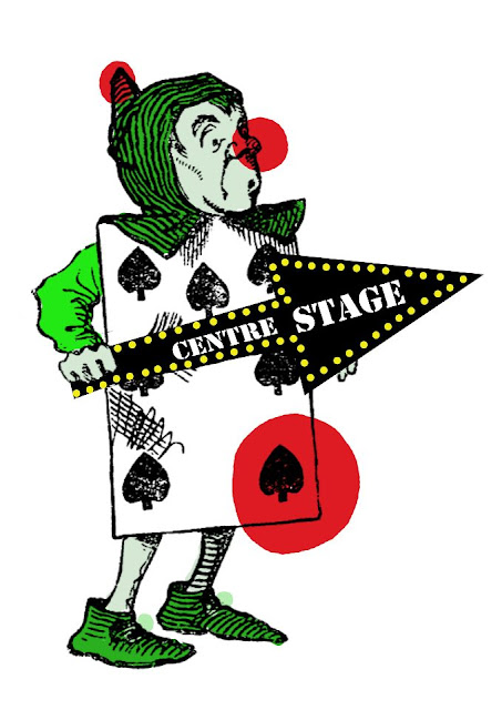
1. Directional Signs (100cm by 50cm)


2. Programme Booklet (inside)


3. Tshirt Design


4. Publicity Poster


5. Ticket Design


Used Alice in Wonderland free photoshop brushes, done on photoshop cs 7.

Website logo (2012)


I had the greatest privilege and honour of designing the cat logo for her website: www.curiouslycomposed.com

(no unfortunately I am not that great in HTML to do the entire website for her)

A music teacher by vocation, she is also an avid composer and is keen on engaging local talent, collaborating with them in coming up with songs and musical pieces.

The logo is a hand-drawn cat with headphones, with musical instruments and notations brimming on the edges of the headphones. The patches of black were inspired by Tommy, her beloved cat. She preferred a more whimsical and original version of a cat, so it took me quite a while to come up with this cartoonish cat.

I really enjoyed working with her, and I couldn't be more grateful for this wonderful opportunity (:

namecard (2012)


Finished product!

This is what I got in return from Nigel:

An entire box of chocolate chip cookies specially baked by him! It tasted really good!
(I think thats why I looked TOO happy here haha!)

Btw, do check out his food blog at www.nigeleats.blogspot.com
Lots of beautifully taken pictures of food that would leave your mouth watering for more! Since his chocolate chip cookies honestly tasted great, if you are keen on trying out cooking or baking on your own, you can check out his own recipes as well!

Thankful for the sincere gift and to Becks for the recommendation!

Tuesday, October 2, 2012

Music concert poster (2012)


 Okay I cannot find my finalised original copy, hence the very faint fonts. The irregular triangles within the shapes of the instruments closely resemble the cuts on diamonds; through music elective programme, our skills are sharpened and polished till we are like diamonds in musicality and technicality. The different colours represent the myriad of genres because there was no theme for the concert, simply a night of music-making.